These are not the worst bugs, but I'd like to mention the aesthetic aspects of illustration & design.
1) The appearance of newer balls on the tee and on the grass : They look so terrible, so sloppy that I'd be really shocked if I was told this was done by a professional illustrator. Honestly, this is not acceptable for a game of this calibre like WGT!

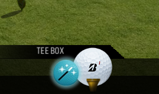
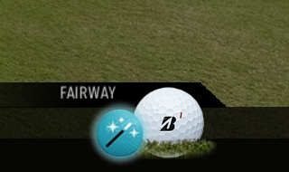
Meanwhile, the illustrations of older balls are just fine.
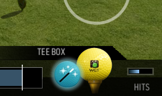

It is, therefore, a matter of how much details, care and efforts you put into, in other words, professionalisme!
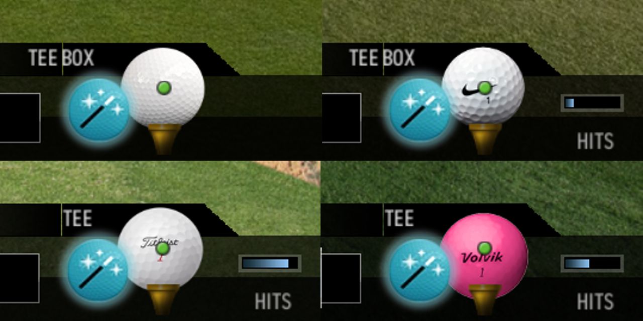
Actually, I mentioned it years ago in another thread showing this image.
2) Sometimes the male avatar's hair glares like a ceramic china!
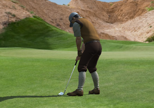
There are more (like the way the female avatar's holding her club with clubface being ridiculously closed), but the above shown are the most noticeable in game and I believe they're easy ones to fix and should be dealt first.