Forums

Help › Forums

Welcome to WGT Early Access!

Sat, May 4 2024 12:17 PM (1,419 replies)
  • DonCaron
    5,502 Posts
    Fri, Oct 4 2019 5:38 AM

    I just got a new high resolution monitor and this game is awesome with the graphics.

    You can see the blades of grass on it.

  • DrCarlGL
    20 Posts
    Fri, Oct 4 2019 8:19 AM

    I can't get past the sign-in page of the Beta Version.  I enter requested info and am told I have an incorrect password.  I checked my password, I AM using the correct password.  What do I do?  

    Thanks, Doc

  • SimonTheBeetle
    3,647 Posts
    Fri, Oct 4 2019 8:52 AM

    DonCaron:

    I just got a new high resolution monitor and this game is awesome with the graphics.

    You can see the blades of grass on it.

    Glad to see at least someone appreciates the new version. You'll be also amazed by the details of avatar's clothing and clubs, Don. There are, of course, lots of works to be done (the avatar's grip on the club for instance. Obviously, whoever worked on that graphic, does NOT play golf for sure.) but they'll get there sooner or later.

    And your idea of course designer/editor is awesome! It's something that I've had in my mind also. Can you imagine playing all those famous beautiful courses around the world or interesting courses created by users with their own imaginations? I'm thrilled just thinking of it! And yet, the company will be free from liabilities as you pointed out.

    Play well and enjoy the new platform, the new era! :-)

    DrCarlGL:

    I can't get past the sign-in page of the Beta Version.  I enter requested info and am told I have an incorrect password.  I checked my password, I AM using the correct password.  What do I do?  

    Thanks, Doc

    I don't know why either but it happens to me every once in a while too. In my case, it's not with the Beta version but with the browser when I try to log on the WGT site from my laptop.

    What I do for this is instead of typing in directly, I punch my password in somewhere else like notepad for instance and copy & paste the text into the box in question. You might wanna give it a try.

    Good luck, Doc.

  • jimbothescot2
    309 Posts
    Sat, Oct 5 2019 3:54 AM

    H tried it and just some of the things I don like

    1 The swing power up to the right  so when you release you have to move don  to the power bar where previously it as just a slide along

    2 The wind indicator very small an difficult to see

    3 club selection slow and awkward

    4 Distance meters too high

    5 Putting grids shorten when in reverse  view  makes it impossible to get a good read

    6 Inability to move the flag on the Hole description currently on the right of the screen

    These are just some of the things I have found , I have never played on the mobile version always play on PC Flash an excellent format

    Don't know why you would want to change it as I am sure most of the serious players are on PC

    I would hope that there is much improvement on what I have just played  If not I think sadly I will be giving up playing and I am sure will be one of many players lost to WGT


  • PureGro1
    1,656 Posts
    Sat, Oct 5 2019 8:43 AM

    Any word on a Linux Version?

  • Dex000
    109 Posts
    Sat, Oct 5 2019 9:08 AM

    I'm a Mac user (still waiting), so I've only played on my phone. Is the putting the same on the desktop version as it is in the mobile game? Putting seems a lot easier on the mobile version, but I can see how ding putters would struggle with it. 

  • FoxyTaffy
    8 Posts
    Sat, Oct 5 2019 9:55 AM

    I know you have a way to go to get it right, I played a few games, but the problem I have is I''m 81 years old with arthitus and I been kicked for not playing fast enough, can you please give the option of changing the time to suit the players. I just cant think fast enough for the game as it is. Thank you, Trevor

  • RDHacker
    103 Posts
    Sat, Oct 5 2019 9:13 PM

    I understand why the swing meter covers most of the screen on the mobile version. The screen on a phone is very small. However on this PC version it should be drastically reduced in size or even better.... give us 3-4 different options for resizing it.

  • DonCaron
    5,502 Posts
    Sun, Oct 6 2019 10:31 AM

    I was just installing a new game and it needed Microsoft VC++ Redistributable. I wonder if thats half the problem with installation. 

  • Woodie312
    671 Posts
    Sun, Oct 6 2019 8:18 PM

    Well here are my thoughts on the Early Roll Out version of the new stand-alone desktop app. I gave it a week of play, mostly the top golf challenge and practice rounds, although I did attempt a couple of CC tourney rounds also. I tried it with my current club and ball choice, and I also used some of the leftover balls in my bag from previous purchases. In other words, I actually tried it out, not just looked at it made up my mind.

    I have a few suggestions to make, but also a few compliments as well. Some of the suggestions I know have been voiced by others, but I am going to reiterate them again.


    The compliments:

    The graphics on everything except the avatars is outstanding! The clarity and terrain modeling is awesome.

    The meter is super-smooth. Nuff said.

    Although this may have been unintentional the oversize color grid when adjusting your aim from the back view is great. This grid shows up if I am looking from the camera behind the green back towards my ball and in punch or pitch mode. It appears to be a 5-10 yd square grid and uses the same blue/red/black as the putting grid but covers the green and its surrounding environment allowing you to get an idea of the balls reaction if (when) a miss-hit occurs.  (I am a land surveyor who draws and looks at terrain models daily so I tend to take all the info I can get in that regard.)
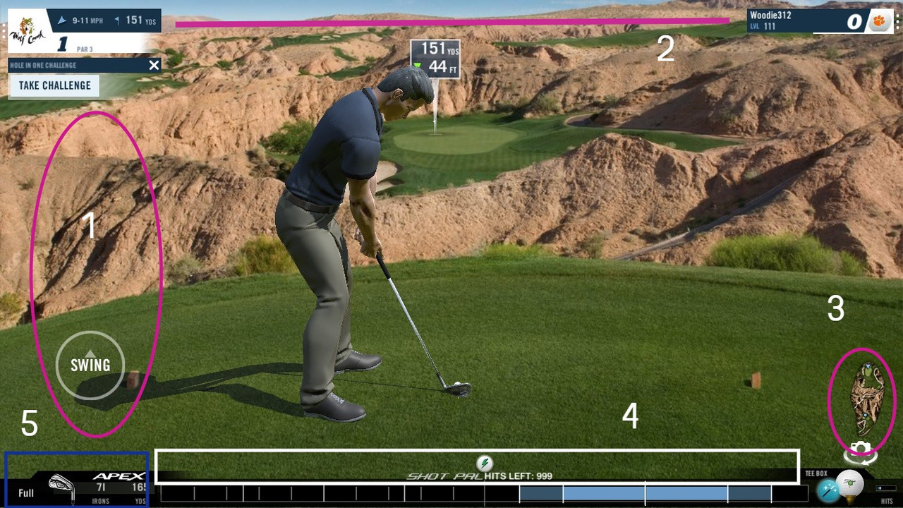


    And now the complaints:

    (#1) After figuring out how to get the swing circle to the left, it needs to be calibrated to the screen size for a desktop. Even in the training mode where you would expect the target circle to line up with your mouse pointer you have to move it twice the distance as suggested on the screen to achieve a full power shot. I think something did not transition well from the pocket screen to the big screen here.

    (#2) I know it is petty, but can we please switch the player info and hole info back to correspond with the flash version. Right now, it is not an issue but when we get short shot clocks in multi-player going having to hunt for info is going to make a lot of folk’s time out for a while.

    (#2A) can we get the wind info enlarged by maybe 25% on the wind speeds? Some of us old, fat, gray-haired but balding quickly guys don’t have the eyesight we used to.

    (#3) The hole map needs to be enlarged to make it useful. (see comment for 2A)

    (#4) Can we get rid of the nuisance text about 999 shots left on putter/shot pal? I know some folks are not in a CC and they purchase these items, but this is a distraction when you are trying to watch your avatar movements and power meter at the same time. (I tend to use both for pitch shots) At worst how about putting it below the power bar.

    (#5) this on is just a downright nuisance (but as with #2 it could become a problem later with timed rounds). If we are not going to be able to scroll clubs with the mouse wheel, can the “caddy box” for club and shot type selection be made to minimize on their own like they do in flash. Currently you have to click to open the box, make your selection, and click to close the option before you can begin your swing. Prior to my finding how to relocate the swing controls to the left side I had several instances of trying to swing but the club not moving due to my click for the drag on the power meter on closed the dang club selection option.

    I am sure there may be many more things that will be noticed as time goes on, but those are the 5 that seem to jump at me.

RSS